


Context
At Securitas, my primary focus lies in digital product development and transformation.
Our overarching ambition is to revolutionize and redefine our customers’ approach to security, while also transforming how our sales and operations teams deliver security services.
The company’s flagship product, MySecuritas, empowers users to access real-time information on security guards’ checks, actions, and observations. This provides them with a comprehensive overview of their company’s security operations and enables self-service capabilities such as managing false alarms.
Currently available in 13 countries with a global rollout, MySecuritas is accessible through both a website and a mobile app for Android and iOS devices.a
The problem
The product consists of several micro apps that address different user needs. Depending on what kind of solution was purchased from Securitas, the users might see a different set of micro apps, such as Guarding, Alarm Services, Risk Prediction. All of them were created in silos, with minimal to none coordination between the teams. Because of this, there was a duplication of elements that should be common, such as user profile, settings, user onboarding. This created an unsynchronized user experience while switching between the services.
The goal
Enable a unified digital client experience and accelerate the delivery process for other apps. Customers should move between different apps while maintaining a consistent experience.
Responsibilities
As the senior UX and UI designer, I played a pivotal role in driving the success of the project. This included conducting in-depth research, defining the UX strategy, and establishing the overall design direction.
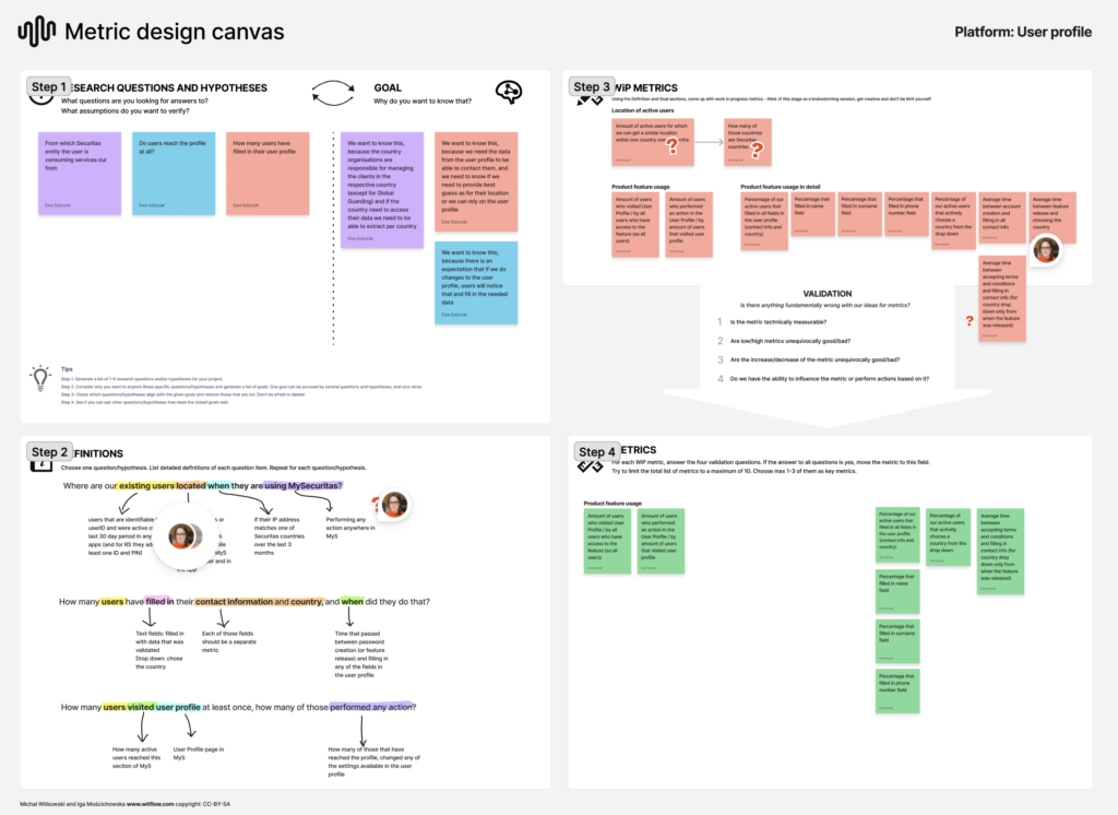
I was responsible for delivering the UI and validating its effectiveness through user testing and creation of meaningful metrics.
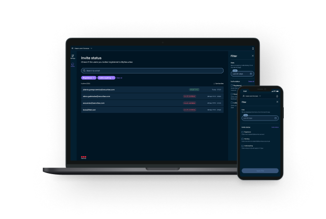

Target group
All MySecuritas users, across all client segments (global, national or small and medium companies) and behavioral profiles. That could include stakeholders such as risk officers in an international company and small business owners.

The process: build, measure, learn
The project spanned a year with multiple releases, following the build, measure, learn framework. We initiated the process by establishing feature priorities.
The features addressed in order of priority were:
- Cohesive navigation
- Account settings
- Notifications
- Log in
- Account creation
- User onboarding
- User management
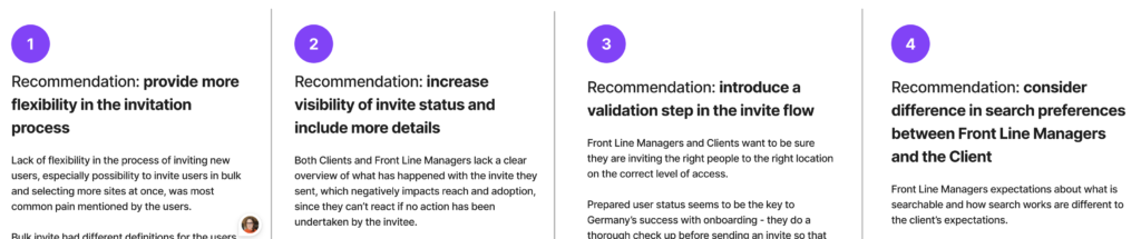
The process for each feature may have varied slightly, but typically I began by addressing research gaps alongside the user research team and formulating relevant recommendations. This initial step led to the development of user flows, which progressively transformed into wireframe sketches and ultimately culminated in the final user interface design. Whenever feasible, I prioritized user tests as a means to identify significant issues and generate recommendations for future iterations.
Discovery Phase
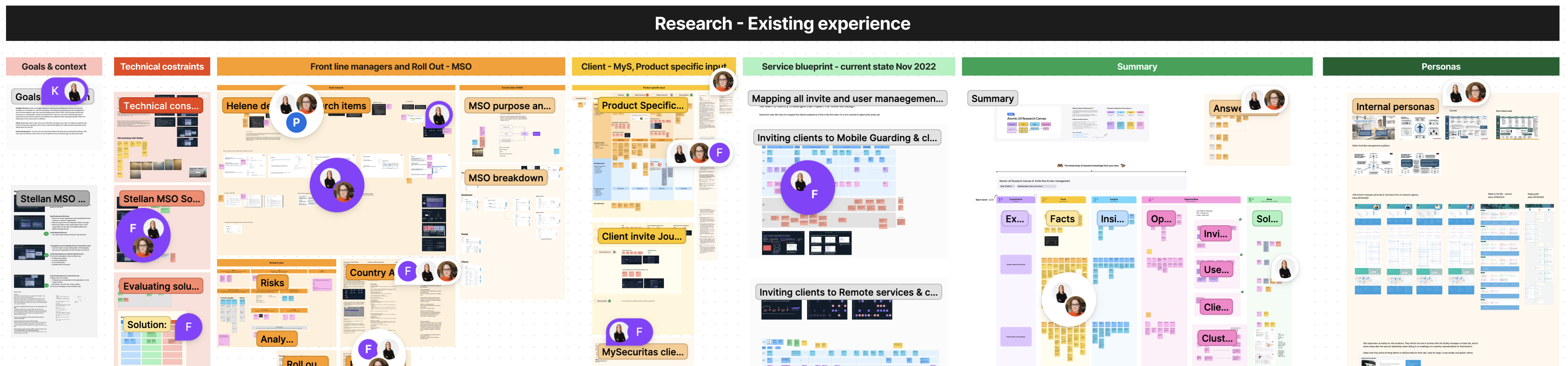
As a start, I evaluated all existing apps and identified potential transferable features together with the project manager. A user story map established the feature priority. The UX discovery process involved adapting research methods based on different app sections. We conducted In-Depth Interviews (IDI) with target groups for some areas and relied on desk research for others.
In select cases, stakeholder interviews were conducted. All gathered information was collated to develop recommendations. Concurrently, we carried out technical feasibility studies together with the solution architect to assess dependencies and ensure practical implementation.
Contents of one of the research boards
Define Phase
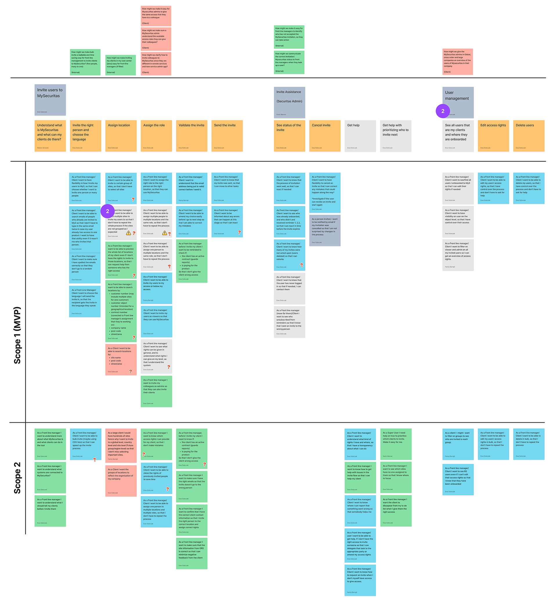
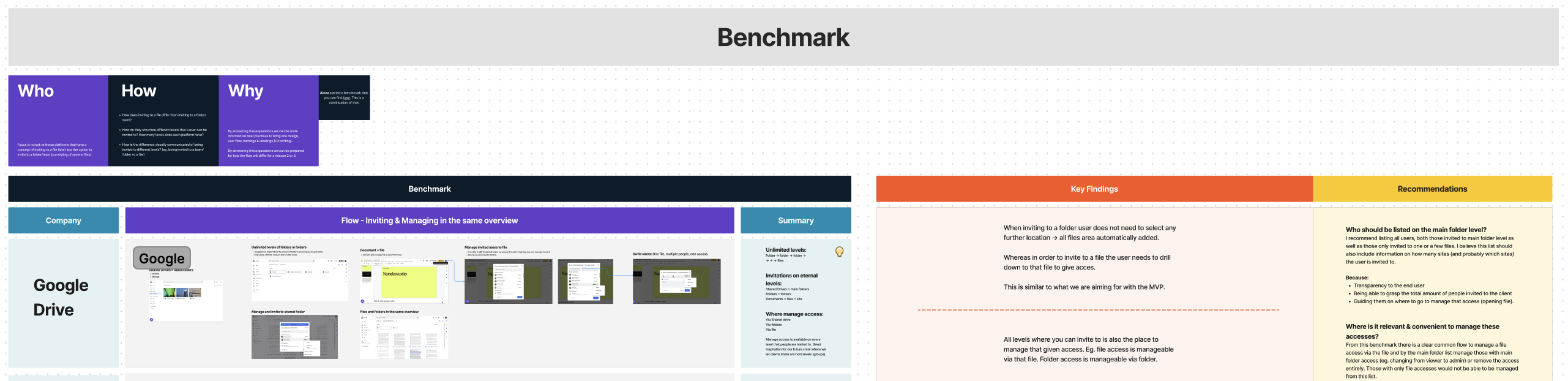
In the define phase, I began by benchmarking other products to identify established UX patterns. This helped ensure that universal features, like login and account settings, adhered to best market practices. User story mapping was then used to plan delivery, prioritize MVP, and future releases.
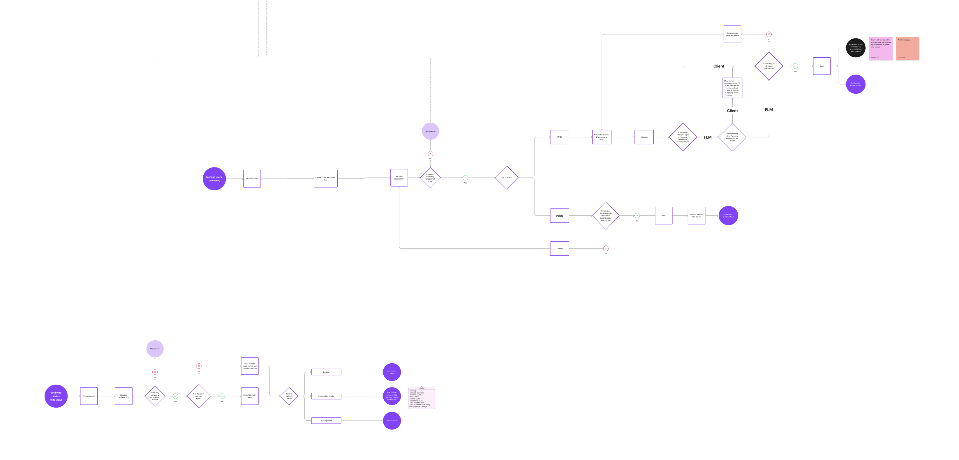
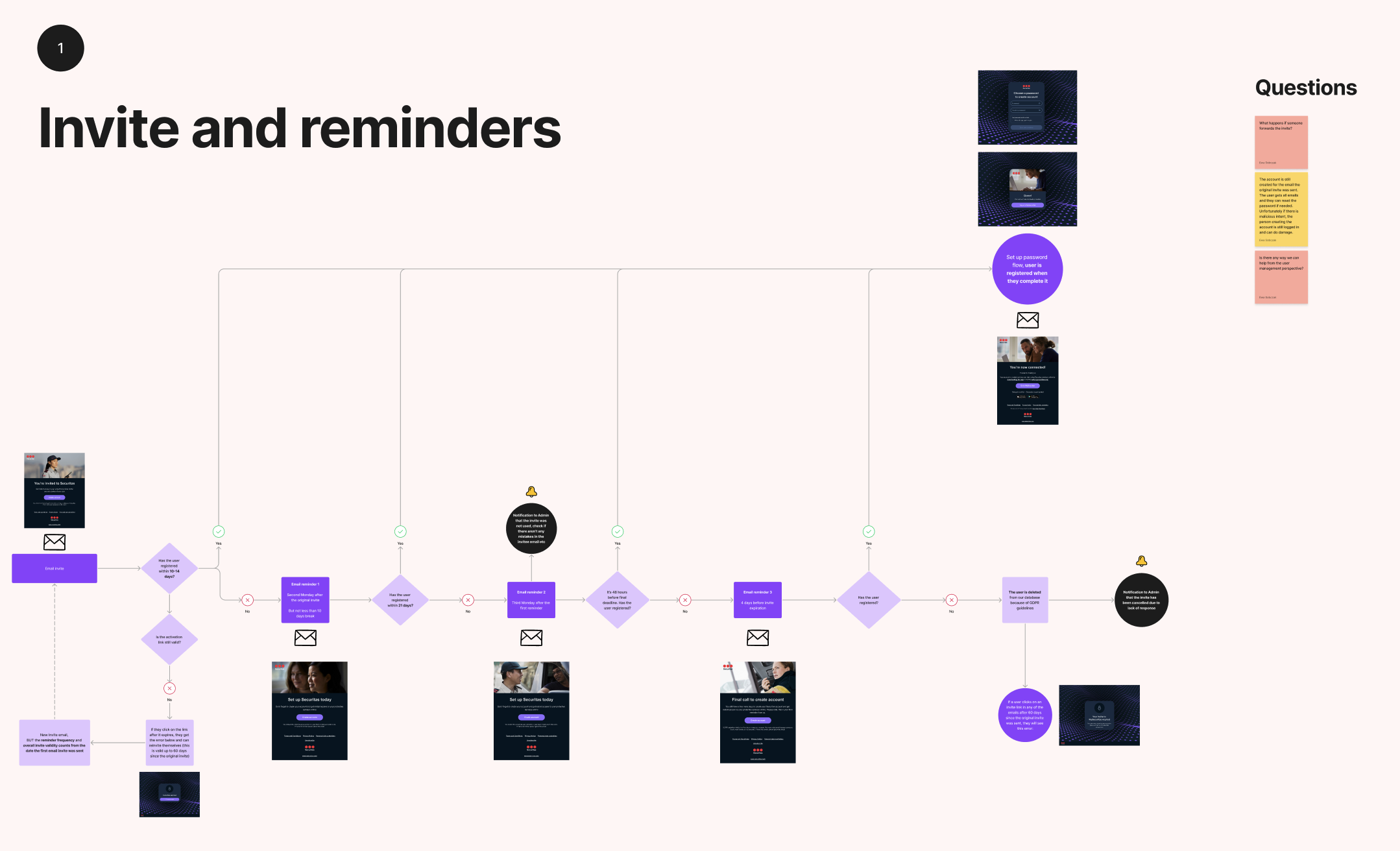
Next, I created user flows, collaborating with the team to assess technical feasibility and gather alternative ideas. Finally, I moved to sketching, generating multiple design ideas through design studio workshops for co-creation.
One of the user story maps
Benchmarking
User flows
Develop and deliver
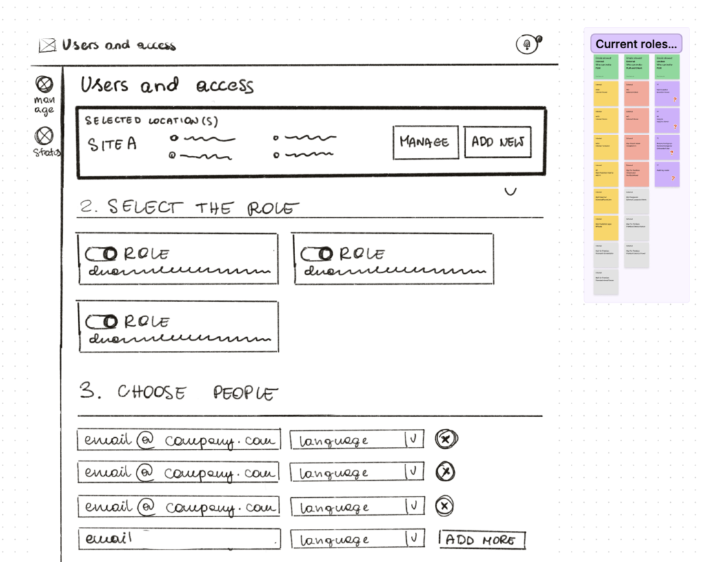
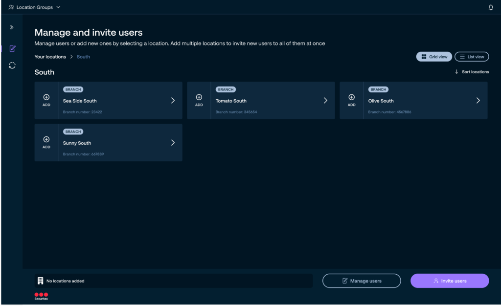
Once the solution was confirmed, I proceeded with UI design. Thanks to our Design System, I could often transition directly from sketches to UI, while ensuring a consistent experience.
Typically, I started with the mobile touchpoint before transitioning to the desktop version. This phase also involved introducing new components and patterns to the design system.
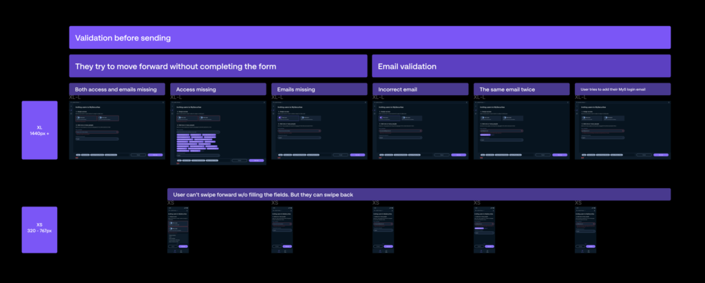
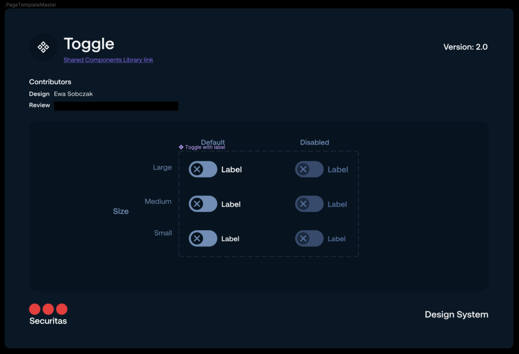
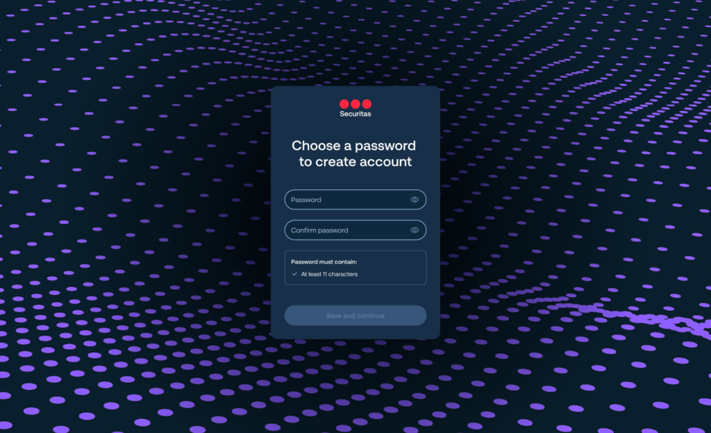
Evaluate
I prioritized the execution of user tests whenever feasible, resulting in a total of three test cycles. Moreover, I developed feature analysis metrics to track the utilization of various features.
This allowed us to identify critical issues prior to development handoff and generate recommendations for future iterations.
Example prototype
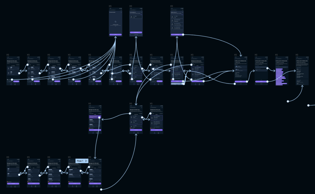
Sample recommendations
Sample metrics
Results

Streamlining parts of the application that are not core to the product helped to reduce time to market for all other services, and to provide a cohesive MySecuritas experience

Unified account creation experience across all services, eliminating disparate flows

Centralized account settings, reducing frustration by consolidating settings management into a single location across all apps.

Consistent notification system with unified UX principles, ensuring notifications are sent consistently and written in a standardized manner, providing users with a centralized notifications hub and a cohesive experience.

Streamlined and flexible user management for clients and internal admins, enabling efficient invitation of multiple users to multiple locations. This accelerated the rollout process of MySecuritas and enhanced self-service capabilities for users.

Lessons learned
A well-maintained design system acts as an accelerator, enabling the bypassing of wireframes and facilitating a swift transition from sketches to UI when necessary. However, caution is advised as this approach may not be suitable for all cases. When dealing with new and unfamiliar features that require deeper exploration, rushing into UI prematurely can impede the design process by prematurely focusing on details.
Conducting small-scale user testing helps identify significant issues early on. For instance, in the user management app, we discovered notable usability challenges and hurdles in completing the desired path due to the removal of location search from the MVP. As a result, this issue was prioritized as a top concern for the upcoming release.
Leveraging quantitative data aids in decision-making. By establishing metrics early on, we gained insights into user behavior, such as the relatively low frequency of visits to the user profile (only around 5% of users completed their profile information). This data informed us that expecting users to voluntarily provide their country information was unlikely. Consequently, we employed alternative methods to gather this crucial data and evaluated the risks associated with potential inaccuracies.