Context
Securitas aims to revolutionize its customers’ approach to security while improving how its sales and operations teams deliver security services.
Their flagship product, MySecuritas, provides users with a comprehensive view of security operations and real-time access to guards’ activities via a website and mobile app. It includes various micro apps tailored to different security solutions, like Guarding, Alarm Services, and Risk Prediction.
However, these apps were developed independently, leading to duplicated features like notifications, user profiles, and settings, resulting in a fragmented user experience. Streamlining this into a centralized platform was essential, all while avoiding disruption in day-to-day operations for users.
Problem

Users were getting time-sensitive notifications such as alarms via email, and that made it hard to be actionable. Also, there was no place where the notifications could be seen all together in a common context.

Most existing apps had their messaging service, but there was no coordination between the length, tone of voice, content, type of notification, and behavior. On top of that, each email had a different design.

Some of the old email notifications contained sensitive data such as addresses. That needed to be addressed for full compliance with GDPR and legal standards.
Goal
Ensure that users receive time-sensitive notifications that are easy to read and act on. Create a workaround for any sensitive data to protect user privacy, but still provide necessary information.
Target Group
This feature targeted all MySecuritas users across various behavioral profiles and client segments, from global enterprises to small and medium businesses, including roles like risk officers and small business owners.
Responsibilities
As the sole designer on this project, I collaborated closely with a user researcher, a product manager, and an engineering team. Partnering with the UX researcher, I addressed knowledge gaps and developed key recommendations. I defined the UX strategy, set the overall design direction, and identified key results. Additionally, I delivered the UI and validated its effectiveness through user testing.

Process
During evaluative research of other MySecuritas features, users recurrently highlighted issues with time-sensitive notifications.
For example, alarms were often sent via email, occasionally ending in spam, causing delayed responses. One application allowed users to disable false alarms, but they couldn’t always do so, leading to unnecessary dispatches of guards and additional costs.
Because of those recurring pains, we knew this was a high-priority issue that needed to be addressed.
Research
I began work by gathering insights related to notifications from all research reports to date and analyzing them to create recommendations about the way forward.
In addition to the inability to respond to notifications promptly, the secondary research highlighted several other significant pain points:

Frustration with non-actionable notifications
Users were annoyed that not all notifications included a call-to-action button leading to the relevant place in the product, making some notifications less useful.

Difficulty in reviewing notifications
Since notifications were only sent by email, users found it challenging to review all of them in one place, causing them to lose context about activities occurring in locations connected to MySecuritas.

Confusion over email notifications
Users were uncertain whether all email notifications were sent by the same product, as there were noticeable inconsistencies in design and tone of voice across different features.
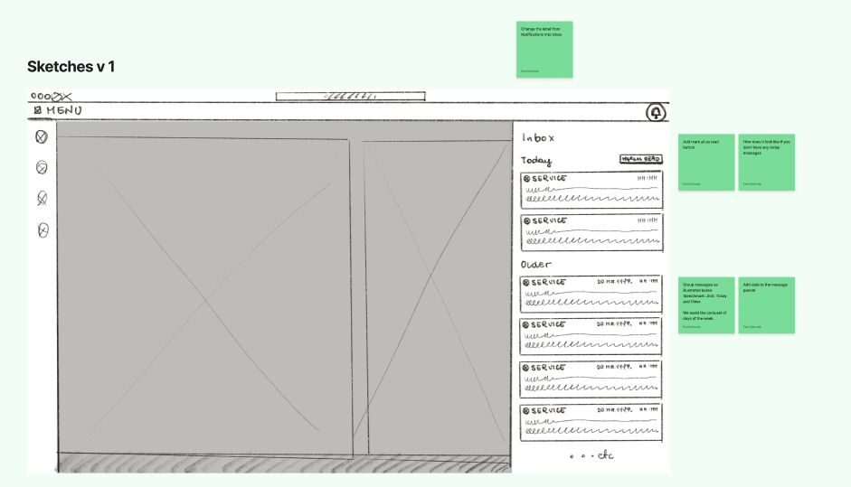
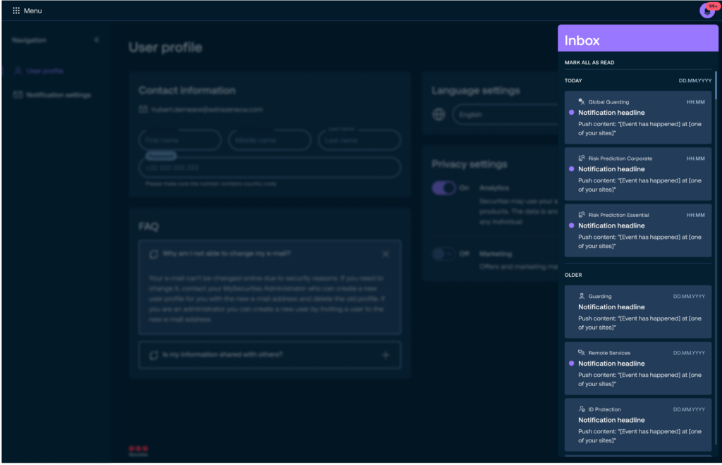
Inbox design
Given this context, it became evident that addressing these concerns required the creation of a system for delivering time-sensitive notifications and providing users with a centralized in-app inbox for reviewing them.
Since the inbox would include notifications from different product areas representing distinct services offered by Securitas, it was crucial to implement a clear way to identify the source of each notification. Furthermore, the inbox needed to follow standard practices, such as marking notifications as read, distinguishing between read and unread statuses, and organizing notifications by their time of delivery.
Following the research, I benchmarked other products and explored best practices for inbox design. My next step was to sketch potential solutions and refine them collaboratively with the team.
After we agreed on a high-level approach, I proceeded to design the user interface.

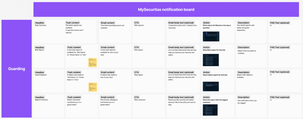
Notification content framework
Once the messaging inbox was finalized, I shifted focus to developing a framework for a configurable notification service.
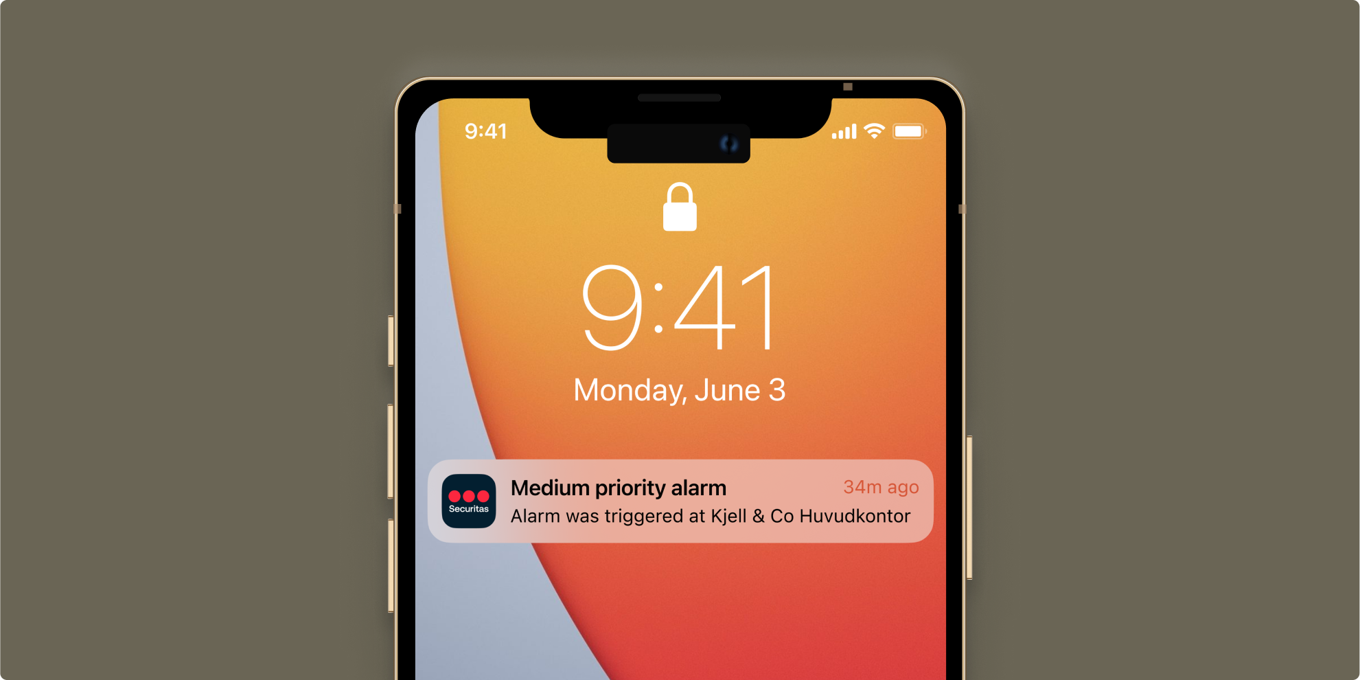
First, a decision was needed about the best channels to deliver the notifications. I explored three of them: email, sms, and in-app/push. At that point, the application was new, and email notifications were essential for driving traffic to it. We decided to use email as a primary external channel but to standardize the design.
While SMS would have been ideal for urgent situations, such as dispatching guards or responding to high-priority alarms, we opted not to pursue it due to time constraints. Implementing SMS would have required approval from the legal department for a provider and the creation of a phone number verification process to ensure messages were sent to the correct recipients. Consequently, we chose to focus on email and push notifications only.
Next, we needed to address how we could ensure that notifications created by other product teams were actionable, consistent in tone, and non-intrusive to users.
Since centrally coordinating every user journey to determine when notifications should be sent was impractical, the team needed the flexibility and tools to create notifications independently. To address this, I organized a workshop with other UX designers and product managers to develop design and writing guidelines for notifications. The goal was to enable product teams to configure notifications with minimal effort, making them plug-and-play, and to agree on the overarching principles as to when the notifications should be sent.
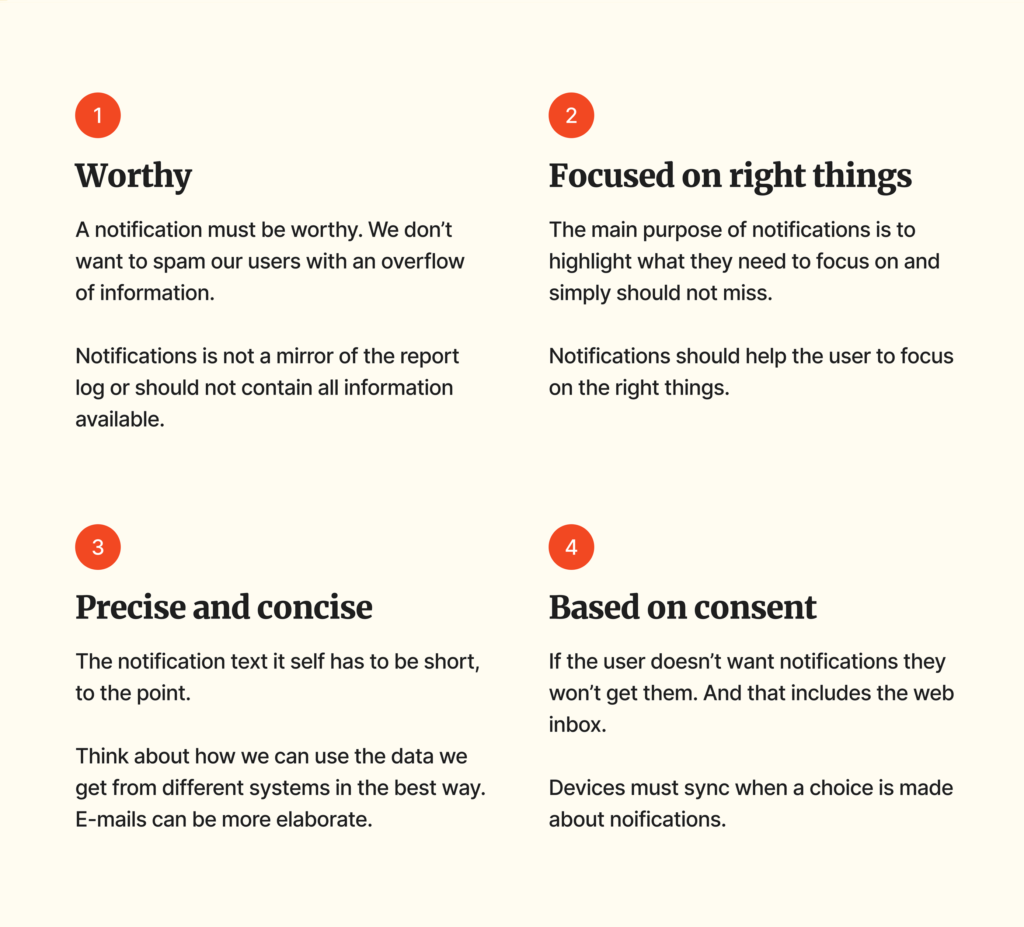
The third challenge was determining whether the same content could be sent via both email and push notifications. After multiple discussions with legal experts about GDPR, I concluded that email content needed to be different. Since email at that time could not include sensitive data like names or addresses, using the same content for both channels would reduce the context provided to users, making it harder for them to make quick decisions. Therefore, push notifications became more elaborate than email.
As a final step, I created a space where other teams could rephrase their existing notifications to fit the new pattern and document the user actions triggered by each notification click. Additionally, I provided a mockup of all touchpoints, allowing them to test how a notification would appear to the user.
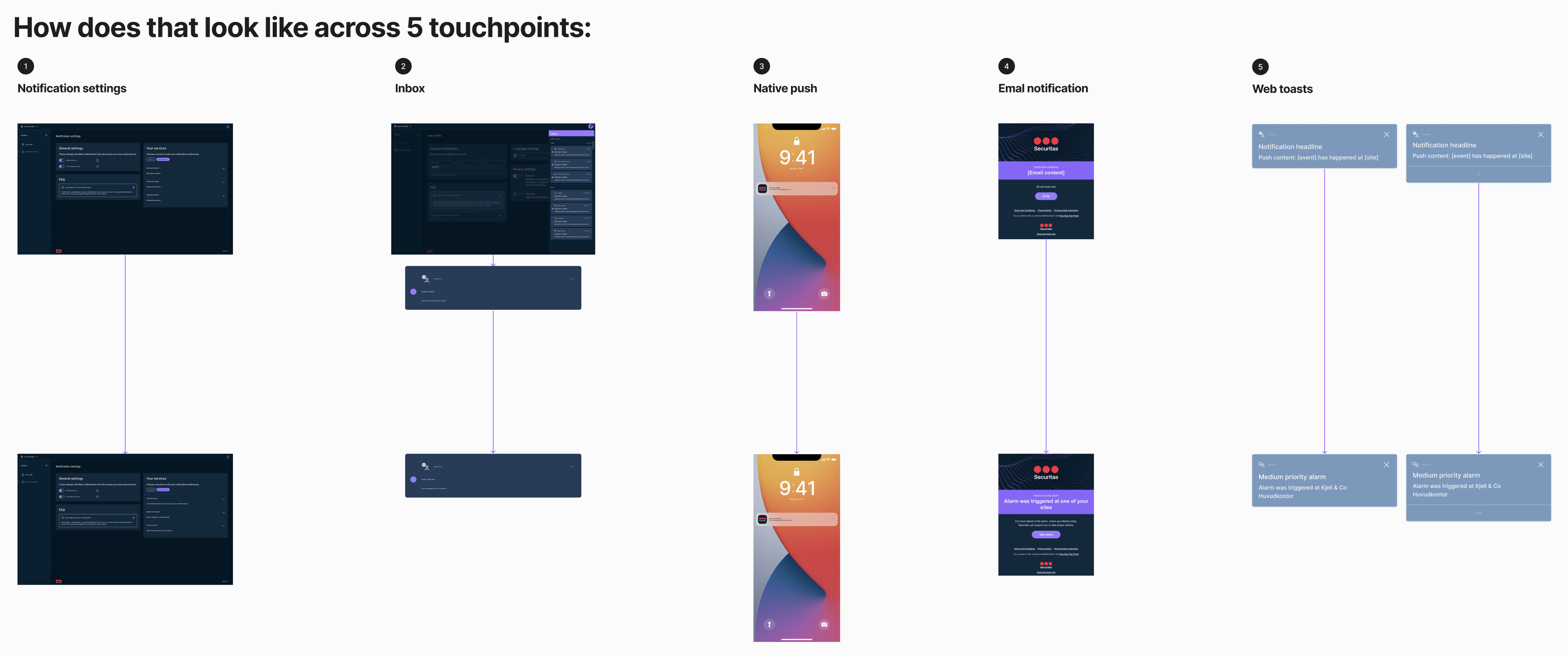
Notifications across all five touchpoints
Results
Consistent notification system with unified UX principles, ensuring notifications are effective, based on consent, and written in a standardized manner.
Lessons learned

Moving forward in silos may be faster, but it can negatively impact the overall product user experience. The development of independent micro-apps, for instance, led to a fragmented experience due to duplicated features.

Leveraging collective intelligence is crucial for addressing common challenges and ensuring a cohesive approach. Conducting a workshop to define the notification framework helped with raising awareness of the common problem and with future compliance with agreed principles.

The challenges of incorporating sensitive data in notifications, particularly with GDPR compliance, highlighted the influence of the legal aspects on software development, especially when handling user data.