Context
Securitas aims to revolutionize its customers’ approach to security while improving how its sales and operations teams deliver security services.
Their flagship product, MySecuritas, provides users with a comprehensive view of security operations and real-time access to guards’ activities via a website and mobile app. It includes various micro apps tailored to different security solutions, like Guarding, Alarm Services, and Risk Prediction.
These apps were developed independently, leading to duplicated features and a fragmented user experience. Streamlining them into a centralized platform was essential while avoiding disrupting day-to-day operations.
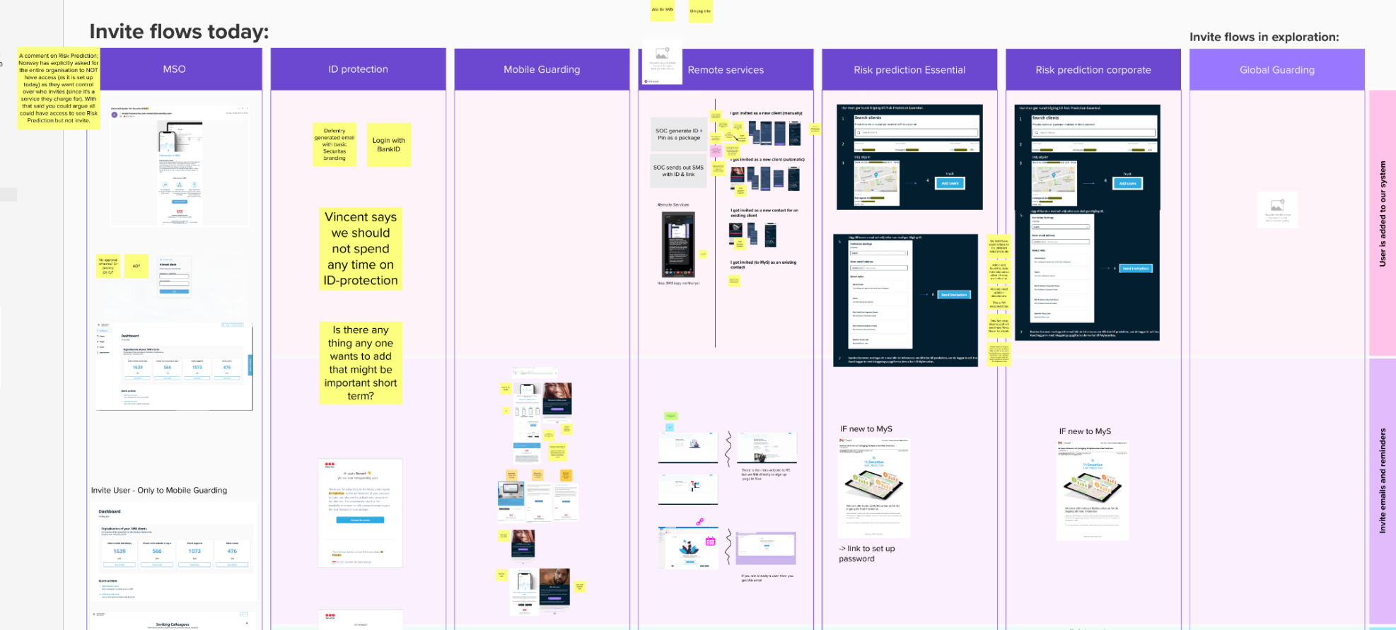
Initially, each micro app handled user onboarding and management independently, sending out invite emails with varying content and designs on uncoordinated schedules. Additionally, a separate user management web app, not integrated into MySecuritas, was used primarily to create administrator accounts for Securitas employees. This app, largely unchanged since 2019 except for minor bug fixes, was slated for retirement with its features to be integrated into MySecuritas.

Problem

Inconsistent onboarding flows. Each service micro app had its own email flow and reminder schedule, creating a confusing user experience. Users had to sign up multiple times for the same service, hindering effective adoption tracking.

Broadened target audience. Initially designed for small and medium enterprises with around 10 locations, MySecuritas’ target audience expanded to include large multinational companies managing hundreds of locations globally, necessitating a more flexible user journey.

Legacy data challenges. Long-standing client relationships led to outdated or insufficient data, slowing MySecuritas adoption. The contact on record wasn’t always the actual MySecuritas user, making the invitation process time-consuming and confusing.

Legal constraints for handling sensitive data. As Securitas transitioned from a decentralized to a centralized organization, providing cohesive global solutions became complicated due to region-specific legal requirements for handling sensitive data.
Goal
Consolidate multiple legacy features into a single solution, simplify the invitation process for easier adoption, and take the first step in adapting the platform for large multinational clients while respecting legal requirements.
Target Group
Front-line managers: MySecuritas super users, such as Securitas’ branch office managers, are responsible for engaging with clients and ensuring correct access rights in invitations.
MySecuritas admins: Users in security leadership positions across all client segments, including risk officers at international corporations and small business owners.
Responsibilities
As the senior designer, I collaborated with a junior designer, user researcher, product manager, and engineering team. I partnered with the UX researcher to address knowledge gaps and develop key recommendations. Together with the junior designer, I defined the UX strategy, set the overall design direction, identified key results, delivered the UI, and validated its effectiveness through user testing.

Process
Unify the email flows
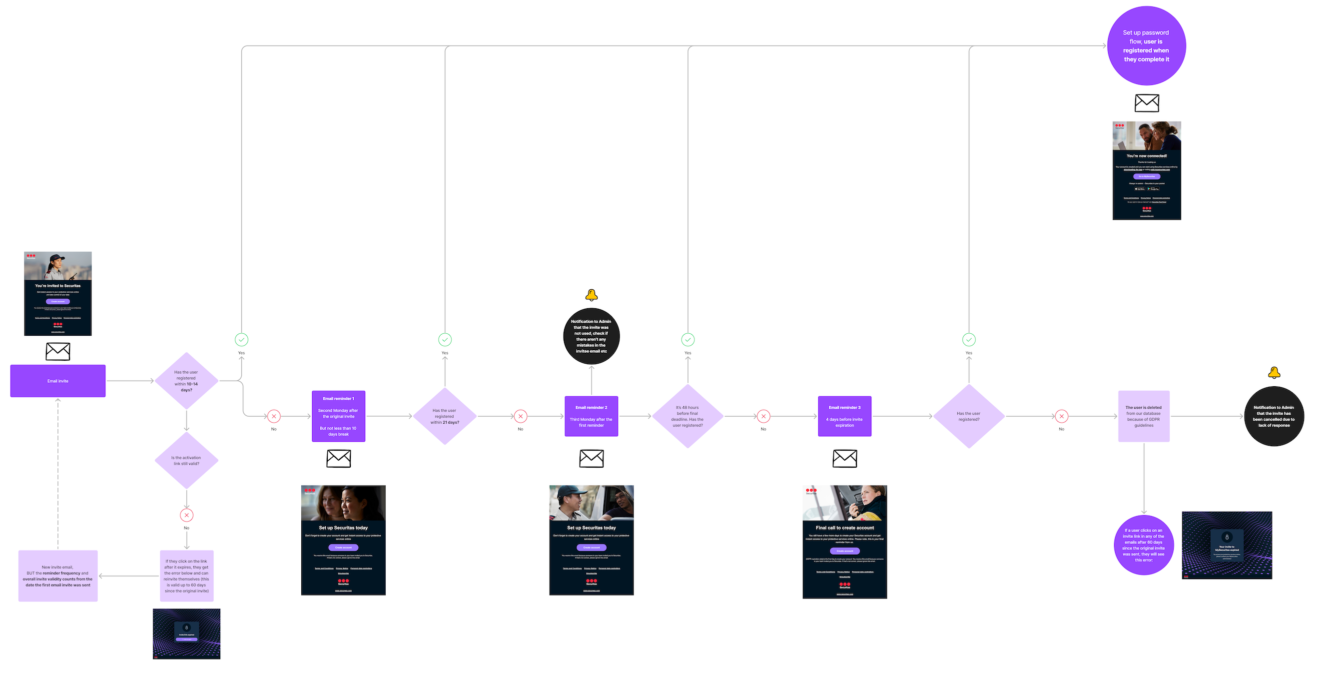
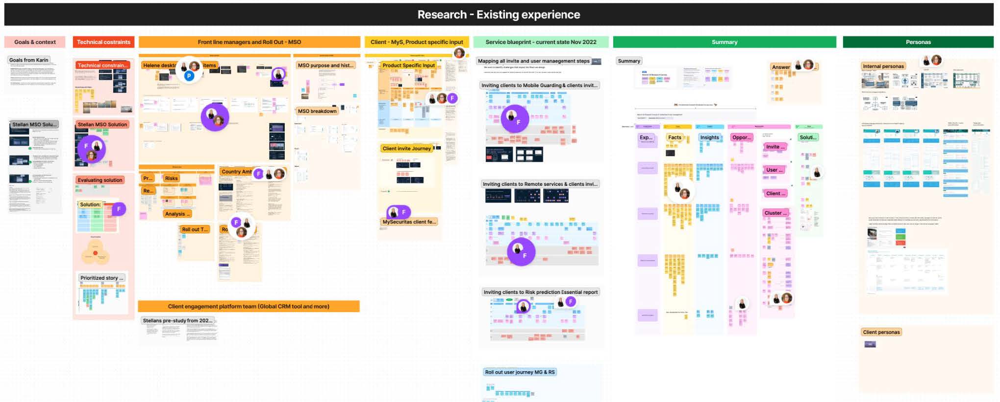
The first challenge was unifying the email flows. I initiated this process by organizing a workshop with all product teams to review and map the existing digital onboarding processes collectively.
Concurrently, I sought quantitative data on adoption rates from front-line managers across different countries. The decentralized nature of our system, where each service micro app and country could set its own invitation and reminder schedules, had created a fragmented data landscape. The German market provided the most reliable and detailed information among the various reports. This data confirmed our assumption that most clients would use work emails for invites and reminders, necessitating a business hours framework. It also revealed that emails sent early on Monday mornings had the highest open rates.
Based on these insights, I optimized the reminder strategy. We implemented a system of three reminders, with invite links expiring after 14 days to maintain security standards. Users were given the option to unsubscribe from reminders.
The first two reminders were scheduled for Mondays just before 9 a.m. to maximize visibility, with a third reminder sent four days before the invite’s expiration. This timing allowed users to respond even if the final reminder arrived over a weekend. Additionally, I took charge of designing and writing the email content, ensuring consistency across all communications.
Discovery for the application
After finalizing the email flow, I focused on improving the user management service application and collaborating with a junior designer. We faced a tight deadline due to an upcoming release of a dependent service application, which led to pressure from the business to simply update the current web application’s look and feel and make it responsive.
However, I questioned the benefit of this approach. The current web application was designed only for Securitas employees and it was using internal jargon. What is more, the existing flows no longer suited our expanded target group, which now included large, international companies alongside small business owners. Moreover, since 2019, user feedback has consistently highlighted navigation challenges, though we lacked a comprehensive understanding of the specific problems.
By pushing back against the quick-fix solution, I secured additional time for gathering crucial insights. Working with the research team, we conducted qualitative research through interviews and tests with users from both target groups. Our goals were to:
1/ Evaluate the current solution and understand the challenges faced by large companies needing to invite numerous people to multiple locations
2/ Document all additional non-digital invite steps and activities to gain a holistic view of the onboarding process.
We mapped service blueprints for all existing micro apps, gaining deeper insight into multinational clients’ needs.
This process led to three key recommendations:

Increase invitation process flexibility
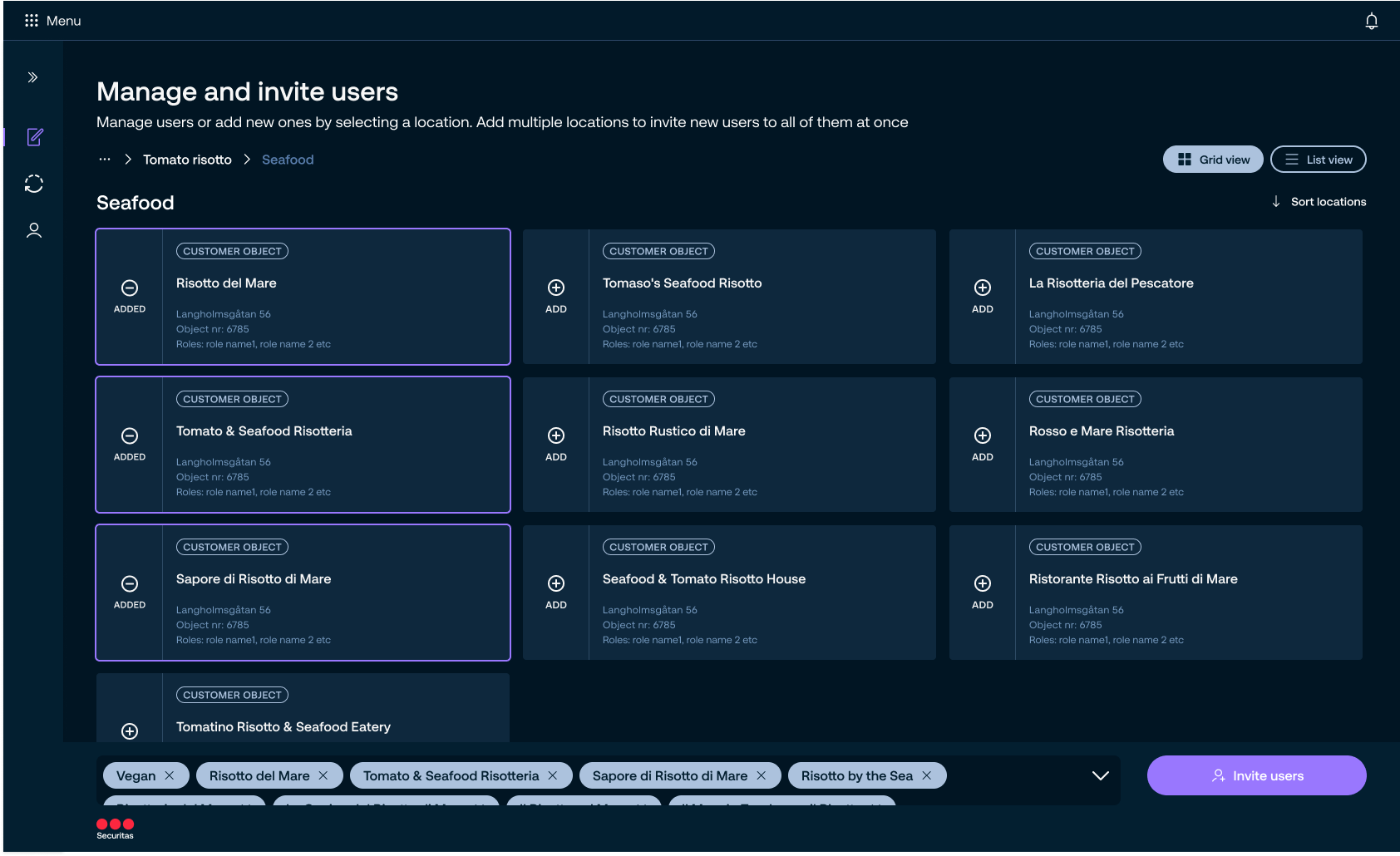
The inability to send bulk invites or select multiple sites simultaneously was a major pain point. “Bulk invites” had varying definitions among users, from inviting a few people to uploading CSV lists with thousands.

Improve invite status visibility
Clients and front-line managers lacked a clear view of invite progress, hindering adoption and follow-up. This issue was particularly acute for large global clients and front-line managers handling bigger teams, making it difficult to prioritize future invites.

Introduce validation
Front-line managers, often inviting people from various companies, needed assurance they were inviting the right individuals to the correct locations with appropriate access levels. This process frequently involved verifying clients’ active contracts and payment status across multiple internal systems, a crucial but time-consuming step for successful onboarding.
How might we solve this problem?
These recommendations provided a solid foundation for moving our design process forward, addressing the complex needs of our diverse user base.
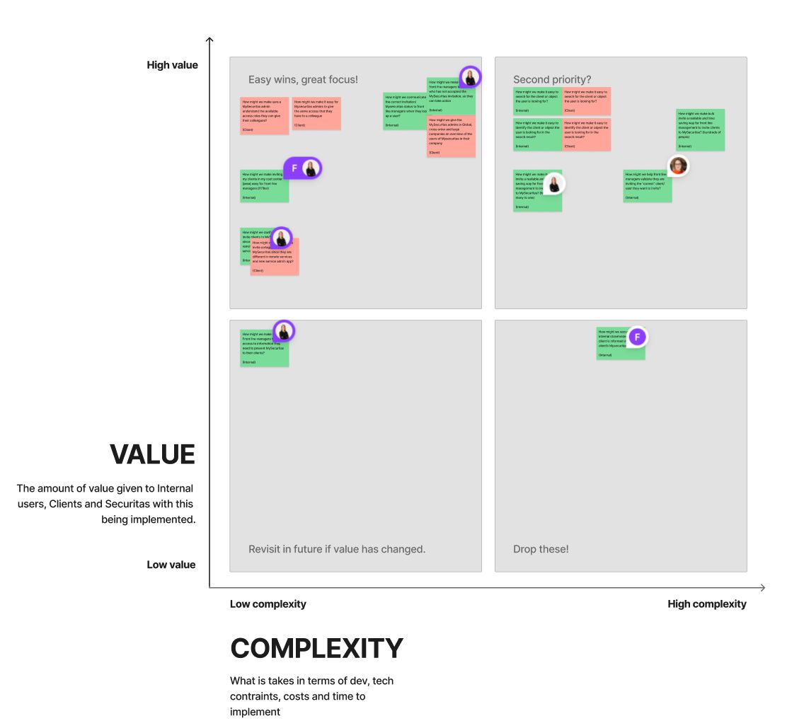
To gain a clearer collective understanding of essential features for the first iteration, we presented the recommendations to the team as “how might we” questions. These were prioritized during a team workshop using an effort and value matrix, with easy wins selected for the initial phase. I then created a user story map, which was refined through further collaborative workshops. Time constraints and database architecture complexity influenced our decisions. For instance, we postponed the feature for inviting multiple people to multiple locations, focusing instead on inviting many to a single location. The search feature was also excluded from the initial phase due to the significant backend work required.
I also benchmarked other products to explore established UX patterns for user management relevant to our case. This included corporate CRMs and solutions like One Drive or Google Drive, as their access models for locations resemble folder structures with inherited rights.
Design and deliver
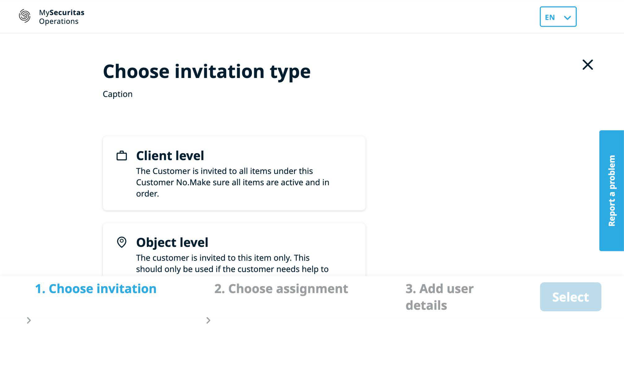
As the next step, I created user flow diagrams for the application, keeping in mind the constraints of the existing backend solution.
This constraint significantly impacted the user experience due to strict legal requirements for handling sensitive data like sensor and camera information. I had to adapt a solution where location and permissions are chosen before invitees, rather than the more intuitive order of selecting people first.
Research has shown this sequence was confusing for users, as it contradicted their expectations. The reason for this approach was that the chosen location determines both the scope of potential invitees and assignable permissions. For example, at higher levels of the access model, only Securitas employees could be invited due to their access to multiple clients’ locations.
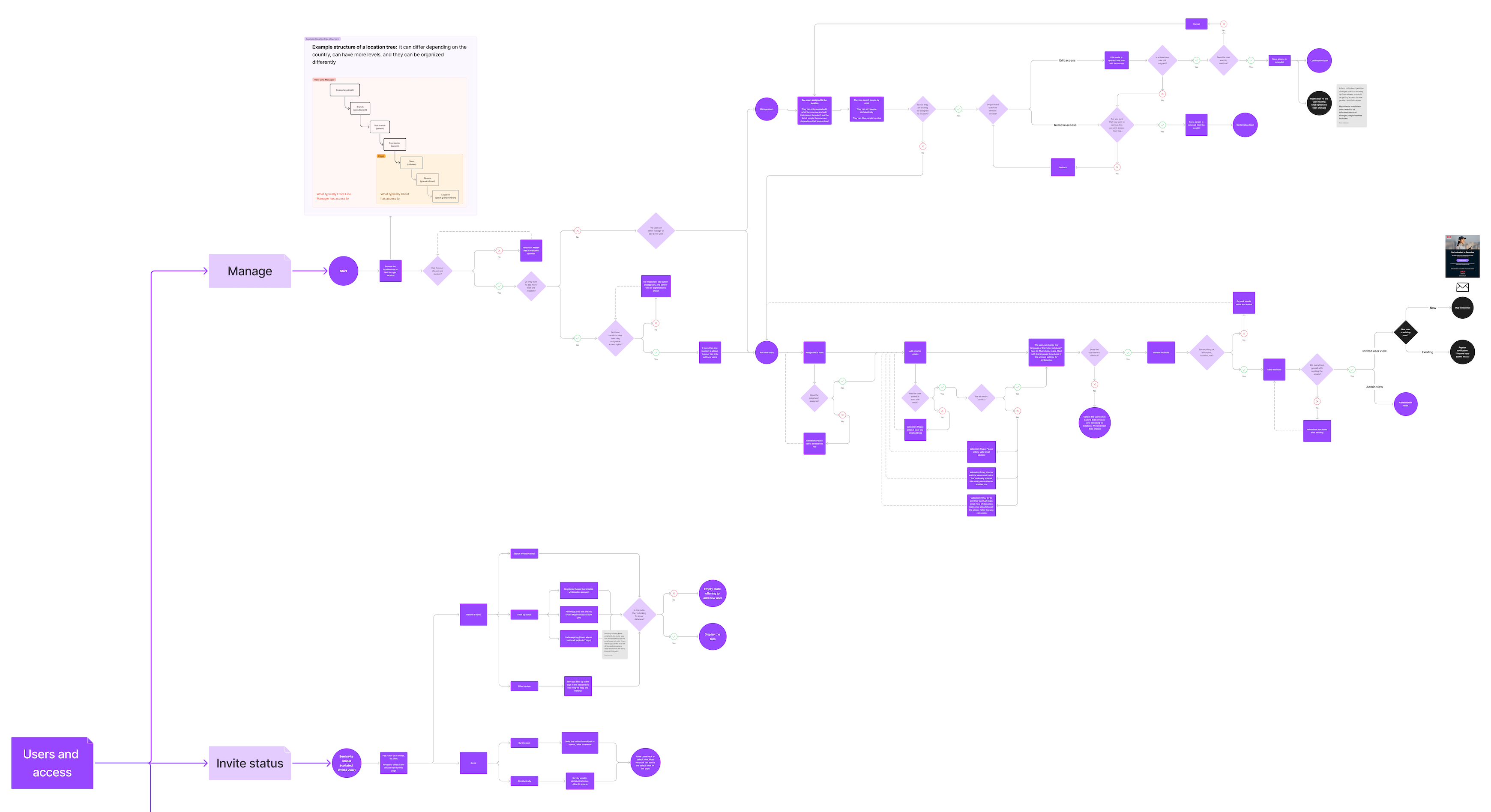
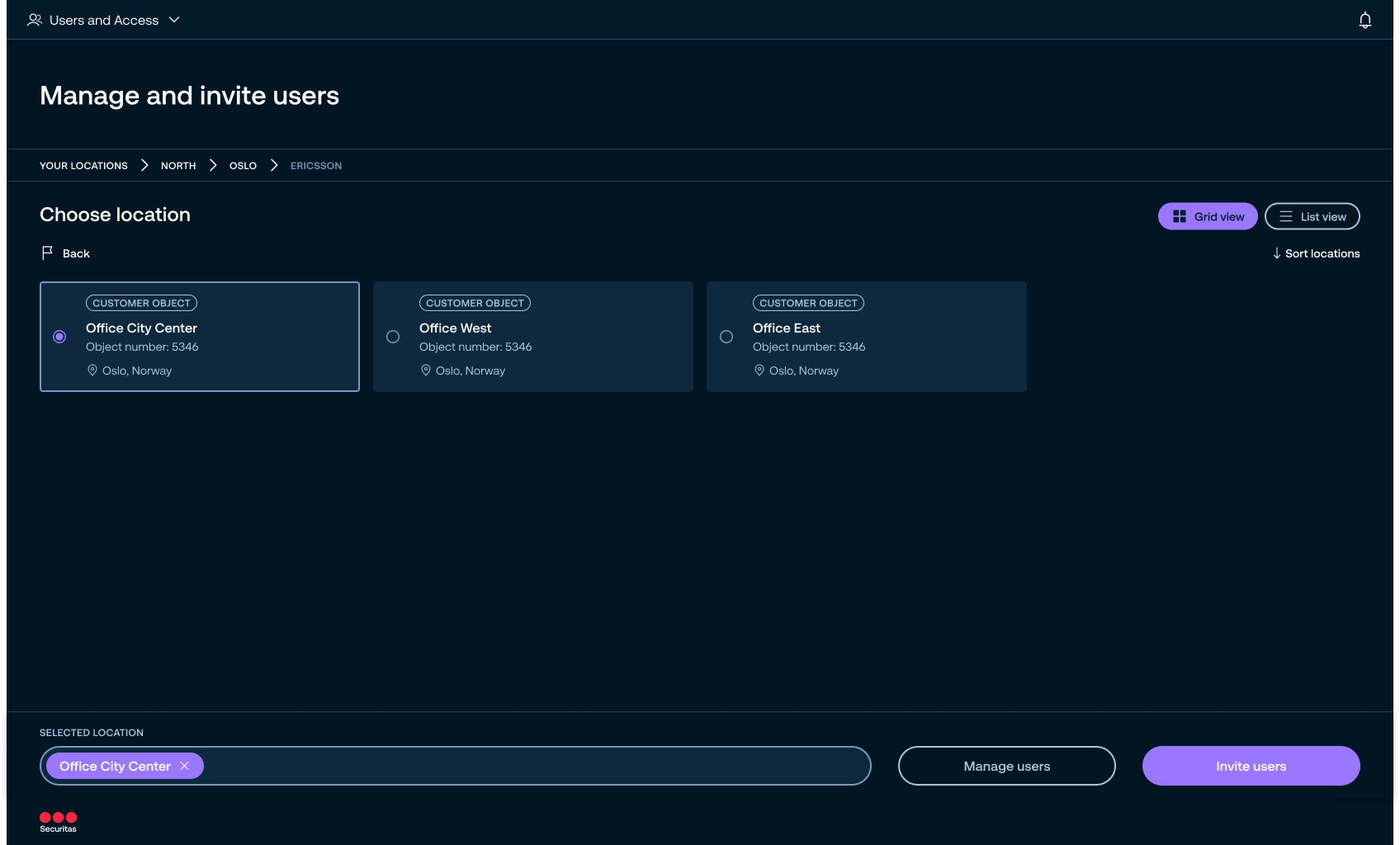
With user flows established, I progressed to sketching and wireframing detailed parts of the flow, followed by high-fidelity design.
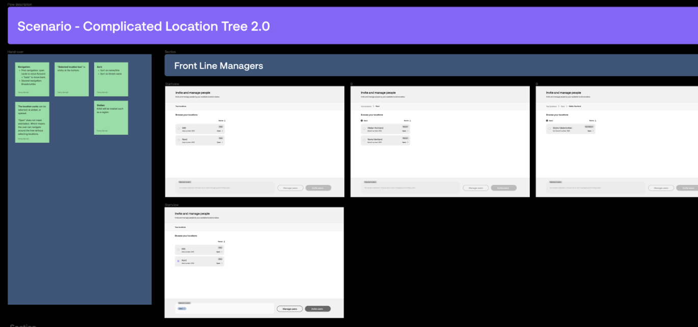
The Securitas design system allowed us to transition directly from sketches to UI for simpler interactions, such as the invite status page. However, more complex interactions, like navigating the location tree, required an intermediate wireframe prototyping step to facilitate discussion.
After handing the UI over to development, we conducted user tests to gather recommendations for the next release.
The results showed that we successfully improved the visibility of invite status and helped front-line managers validate invited users.
However, we also uncovered significant usability challenges stemming from the removal of location search in the first iteration.
Validate and iterate
We had assumed users could complete the flow without search and filter functionality, believing they would know their location tree well enough to navigate manually. While this held for client admins, it proved problematic for Securitas front-line managers.
Their areas often have complex access models with numerous sub-branches and clients, making manual navigation difficult. Moreover, the strong expectation for search functionality led to confusion, with users mistaking other features for search and becoming frustrated when they didn’t work as expected.
As a consequence, search was prioritized as a highly important feature in the next release.
Results
1/ A globally standardized email cadence and content, reducing confusion and unifying data points, allowing decision-makers to track user adoption more effectively.
2/ Improved visibility of invite status, supporting better adoption tracking and timely follow-ups.
3/ A cohesive experience tailored to complex organizational structures, with enhanced flow flexibility through the bulk invite feature for single locations, and groundwork laid for future multi-location invites.
4/ A validation step was introduced in the invite flow, reducing errors and alleviating user anxiety.
Lessons learned
Always negotiate time for research and to evaluate the solution. It might be tempting to continue along the path of least resistance, but combining quantitative data with qualitative insights from user interviews provided us with a holistic understanding of user needs, revealing key challenges that a simple design update wouldn’t have uncovered. User testing challenged our assumptions about the delivered solution and revealed areas for improvement

Navigating legal requirements and backend limitations requires creative problem-solving and sometimes results in less intuitive user flows. Balancing these constraints with user expectations is critical.

Collective prioritization workshops such as effort-value matrix or user story mapping help to create a common understanding of essential features, ensuring focus on high-impact elements while postponing the less valuable ones, leading to more effective decision-making.